an online store that makes a new product feel instantly understood.
a clean, intuitive eCommerce experience designed to showcase the product and make buying feel effortless.
CONTEXT & GOALS
the challenge
challenge: Whiff had a strong product - bottles designed to work with scent pods - but they needed a website that could properly support selling them online.
- • smooth
- • easy to navigate
- • trustworthy
In eCommerce, small friction points matter. If the site feels clunky or confusing, people drop off quickly.
There was also the challenge of explaining the product clearly.This isn’t a standard bottle - so the site needed to quickly communicate how it works and why it’s worth buying.
So the goal was clear: build an online store that feels simple, explains the product clearly, and makes the buying process effortless.
Design Execution
the solution
We focused heavily on the full user journey, from first visit through to checkout.
- • browse easily
- • understand the product quickly
- • purchase without friction
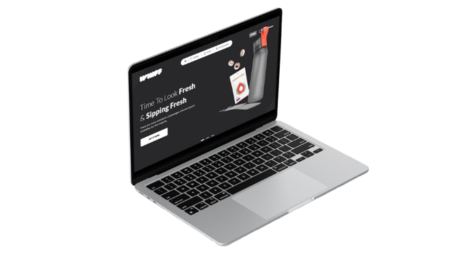
The overall design keeps things consistent and on-brand, giving Whiff a more established and recognisable digital presence.
Nothing unnecessary.No clutter.Just a clean setup that lets the product stand out.
-
On the technical side, we:
- • integrated a secure payment system
- • streamlined the checkout process
- • removed unnecessary steps
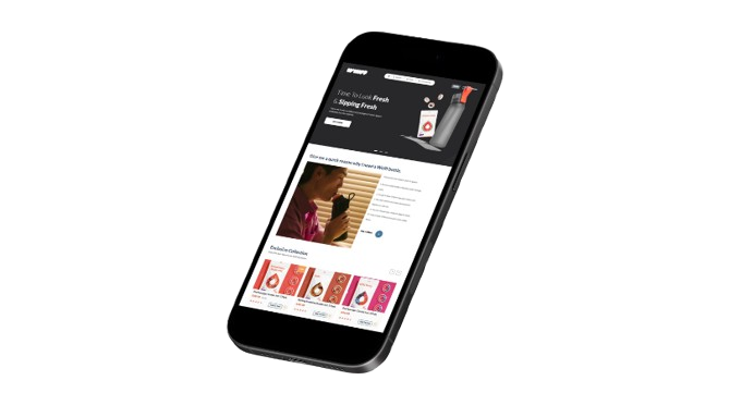
Responsiveness was key throughout - ensuring the experience stays consistent across desktop, tablet and mobile.
WHO THEY ARE
the client
Whiff is a product-led brand offering innovative bottles designed to work with scent pods. Their focus is on creating a unique, functional product - supported by a digital experience that makes it easy for customers to understand and buy.
Impact & Outcomes
the results
- • improved product understanding
- • smoother browsing experience
- • streamlined checkout journey
- • consistent performance across all devices
- • stronger, more credible online presence
STEP 1
The backstory
Whiff had great products, but their website was getting in the way of sales. Slow load times, confusing navigation, and a checkout process that felt clunky. It needed a complete overhaul.
STEP 2
What we were trying to fix
People were abandoning their carts. Some couldn't find what they were looking for. Others didn't trust the checkout process. We needed to fix all of it — fast.
STEP 3
How we approached it
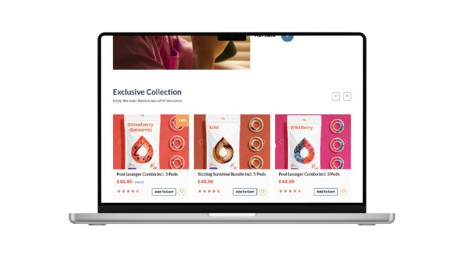
We restructured the product categories so they made sense at a glance. Product pages are clean and clear, with high-quality images and straightforward descriptions. And we rebuilt the checkout to be fast, secure, and reassuring. The result? An e-commerce site that actually helps the business sell.
KEY FEATURES
designed for
impact.
clear product storytelling
The site makes it easy to understand how the product works and why it matters.
clean, focused layouts
Minimal design that keeps attention on the product and reduces distractions.
frictionless checkout
A simple, secure purchase journey with no unnecessary steps to complete the order.
fully responsive experience
Consistent performance and visual integrity across desktop, tablet, and mobile.
ready to get started?
Drop us a line. We promise we're friendly, we reply fast, and we won't try to sell you
stuff you don't need.