Making complex medical knowledge easier to access - without watering it down.
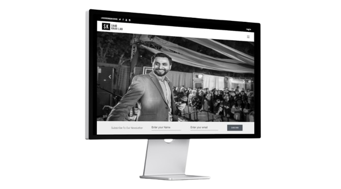
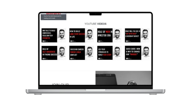
an advanced education platform designed to deliver research, teaching and interactive learning in oral surgery and public health - all in one seamless experience.
CONTEXT & GOALS
the challenge
Dr. Saad Khan needed a way to bring his work into one place. His research, teaching and practical insights existed across different formats, but there wasn’t a single platform where students and professionals could access everything easily. The challenge wasn ’t just about putting content online. It was about making complex medical knowledge:
- • clear
- • structured
- • easy to navigate
- • engaging without losing depth
Design Execution
the solution
We focused on clarity first. The platform was designed to organise complex information into a structured, easy-to-follow experience, allowing users to explore topics without feeling overwhelmed.
- • a clean, intuitive interface
- • clearly organised content categories
- • seamless navigation between topics
- • a balance between academic depth and usability
WHO THEY ARE
the client
Dr. Saad Khan is an Oral Surgeon, Public Health expert, and PhD holder, as well as a Clinical Professor. His work focuses on bridging the gap between research and real-world medical practice, helping students and professionals apply knowledge in meaningful ways.
Impact & Outcomes
the results
The platform now brings everything together into one cohesive experience.
- •centralised access to educational content and research
- • improved clarity across complex subject matter
- • more engaging and structured learning experience
- • stronger professional and academic digital presence
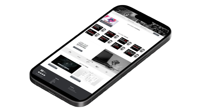
- seamless usability across all devices
STEP 1
The backstory
Saad Khan Lab provides high-quality dental care in a welcoming environment. Their website needed to reflect that — not scare people away with overly clinical design or confusing navigation.
STEP 2
What we were trying to fix
The old site didn't feel human. It looked like every other dental website: cold, corporate, and overwhelming. That's a problem when you're trying to reassure nervous patients and make booking an appointment feel easy.
STEP 3
How we approached it
a We kept the design warm and open. Soft colours, clear headings, and language that feels approachable, not corporate. Services are explained in plain English, and the booking system is simple and mobile-friendly. The result? A site that feels as welcoming as the practice itself.
KEY FEATURES
designed for
impact.
structured learning experience
Content is organised in a way that guides users naturally through topics without overwhelming them.
clear, accessible information
Complex concepts are presented with clarity, making them easier to understand and apply.
interactive elements
Learning is supported through features that encourage engagement and deeper understanding.
multi-disciplinary content
A platform that brings together research, education, and practical insight in one place.
ready to get started?
Drop us a line. We promise we're friendly, we reply fast, and we won't try to sell you
stuff you don't need.